K-Means
The K-Means tool is an algorithm that finds similar data points and groups them into clusters.
Menu Access: Analysis > K-Means
Toolbar Icon: 
Running the Analysis
Go to the
Windowmenu and select one of the data tables. This will bring the selected table window to the front.
Start the K-Means tool by clicking on the icon in the toolbar or via the
Analysis>K-Meansmenu.In the
Configuration: K-Meansdialog, define the number of clusters, initialization method, algorithm type, number of runs, max iterations, and tolerance value.Clusters: The number of desired clusters. There are several methods, such as the elbow method or just by plotting and noting data groups, that can help choose the optimal number of clusters.Initilization: Eitherk-means++orrandom. This refers to the type of cluster initialization used, with k-means++ initializing points further away from each other. This means that using k-means++ is typically more efficient at finding clusters than random, as it requires less iterations to evenly dispursed custers.Algorithm: EitherAuto,Full, orElkan. TheAutooption will automatically use the classical EM-style algorithm, calledFull, for sparse data andElkanfor dense data. TheElkanmethod is more efficient on well-defined clusters, but uses more memory.Runs: Number of times the centroids will be initially replaced.Max Iterations: Number of times the centroids will be recalculated to optimize clusters per run.Tolerance: Relative tolerance used to declare k-means convergence, which is when the clusters are fully optimized.

Select the data features of interest. Data features correspond to columns with numeric data,
FAD a1, etc.. In the example, only FAD a1 and NAD(P)H a1 are used.Click
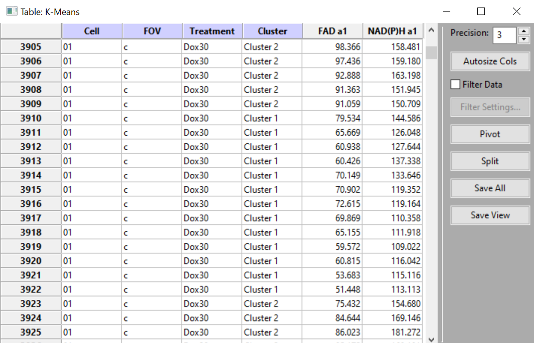
OK.The analysis results are shown in new data table, with an additional categorical column labeled
Cluster. Each data point is now grouped into one of these clusters.
Example Output
Example Results:
Results when only FAD a1 and NAD(P)H a1 being used:
Note
To see the the clusters plotted on a graph, you can use one of the plotting tools to do so by grouping the data by cluster.
Results of using a scatter plot to plot the data by Cluster:

While not the best example, since the data points are not very separated and there are not clear clusters, the scatter plot still provides a visual as to how the K-Means tool groups data points.