FLIRR Plot
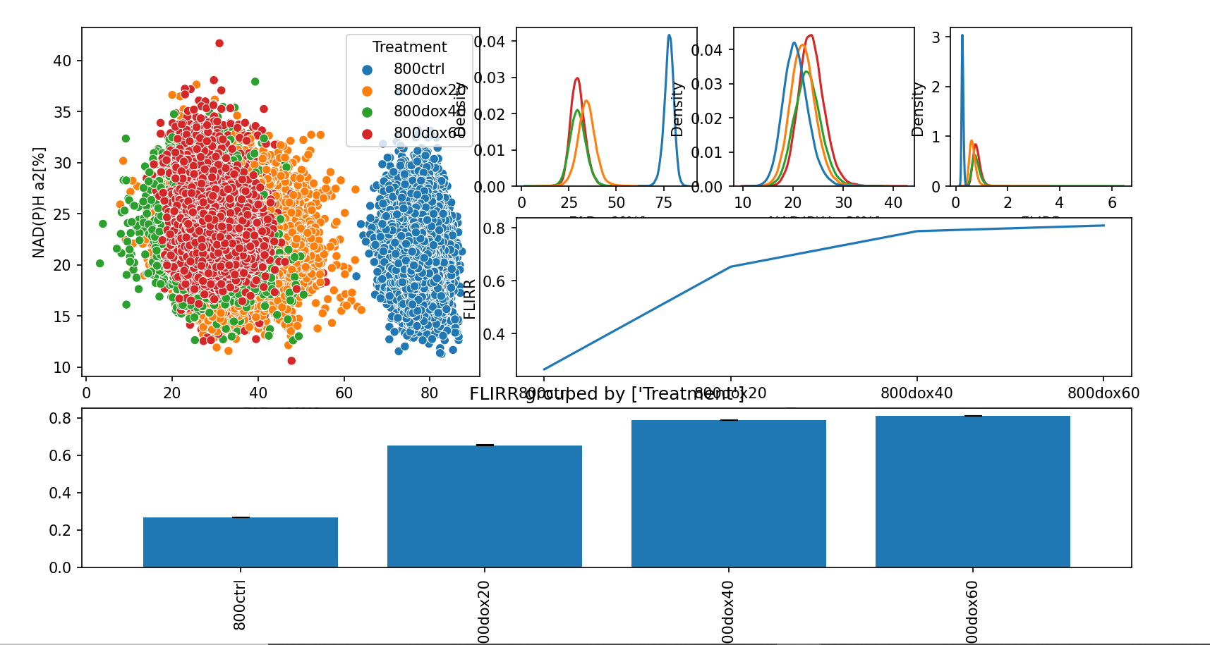
The ‘FLIRR Plot` tool creates a scatter plot, line plot, and KDE plots based on the selected data grouping to visualize FLIRR (Fluoresence Lifetime Imaging Redox Ratio) trends.
Menu Access: Plot > FLIRR Plot
Toolbar Icon: 
Creating the Plot
Go to the
Windowmenu and select one of the data tables. This will bring the selected table window to the front.
Start the FLIRR Plot tool by clicking on the icon in the toolbar or via the
Analysis>FLIRR Plotmenu.In the
Configuration: FLIRR Plotdialog, select the desired data grouping.
Click
OK.The plots will all appear in a separate window.
Example Output
Example Results: FLIRR Plot
Note
Plots can be manipulated and saved as described in the Plots section.